As mobile applications become increasingly sophisticated, the design of navigation bars remains a critical factor in creating seamless, efficient user experiences. As users demand more intuitive, accessible, and visually pleasing interfaces, the mobile navigation landscape continues to evolve rapidly. In 2026, designers are prioritizing patterns that maximize engagement and usability, making strategies like mobile navigation central to outstanding app design. Each navigation design offers unique advantages tailored to specific app requirements and user expectations.
The evolution of user interaction with mobile interfaces emphasizes ergonomic design and context-driven features. Modern navigation bars aim to minimize cognitive overload while ensuring quick access to vital functions, balancing visibility, simplicity, and versatility for an optimal user experience. Designers must consider hand sizes, app types, and accessibility to promote inclusive solutions. While traditional patterns like bottom navigation and tab bars persist, emerging paradigms such as gesture-based and context-aware navigation are setting new standards. The focus on accessibility underscores the significance of inclusive design. Staying up to date on navigation best practices through usability studies and insights from platforms such as Android and iOS is crucial for maintaining competitiveness in the mobile market.
Bottom Navigation Bars
Bottom navigation bars remain a consistent choice for many mobile apps due to their thumb-friendly location. Placed at the bottom of the screen, they allow quick switching between 3 to 5 key sections, such as Home, Search, and Profile, as found in major apps like Instagram and Spotify. Their ergonomic advantage is recognized in research cited by Nielsen Norman Group, pointing out that users instinctively reach for controls at the base of their devices. However, adding excessive tabs can lead to clutter, diminishing clarity, and hindering navigation effectiveness. Designers should prioritize the most important sections while keeping the layout clear and concise.
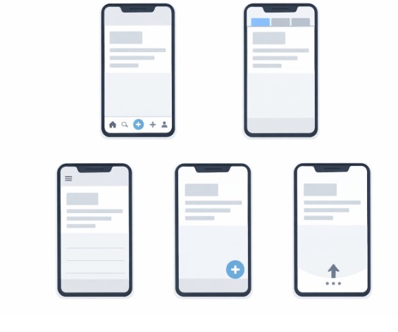
Hamburger Menus
The hamburger menu, signified by its three stacked lines, is a long-standing navigation element that hides a multitude of app sections behind a compact icon. This approach is ideal for applications with deep content structures or secondary actions that do not require immediate attention. However, several usability studies highlighted by Smashing Magazine reveal that hiding navigation items behind a menu can decrease visibility and reduce overall interaction rates. Therefore, it is most effective to use the hamburger menu for non-primary navigation while ensuring that essential actions remain accessible elsewhere on the interface.
Tab Bar Navigation
Tab bar navigation also sits at the bottom of the screen, presenting distinct sections through clear icons and text labels. This method enables constant visibility for top-level categories and is especially effective for apps where users need to switch between a handful of equally important screens. The strength of this pattern lies in its simplicity and immediate access. Apps like YouTube and WhatsApp leverage tab bars to make frequently used features reachable at all times, improving overall engagement and retention. Still, the limitation in space restricts the number of sections, making this unsuitable for feature-heavy applications or those with many organizational layers.
Gesture-Based Navigation
Gesture-based navigation eliminates traditional buttons in favor of intuitive swipes, pulls, and taps, creating a full-screen experience that emphasizes content. Google’s Pixel devices and Apple’s iOS exemplify this minimalist approach, enabling immersive interactions without cluttering the interface. However, the risk of usability issues is high unless users are guided through onboarding tutorials and provided with subtle visual cues, as users unfamiliar with new gesture paradigms can be confused or miss key functions. Effective gesture navigation enhances both the elegance and the efficiency of the user journey when implemented thoughtfully.
Floating Action Buttons
Floating Action Buttons (FABs) are circular, elevated controls that draw attention to a primary app action. Their bold design ensures they stand out above other interface elements, which is why many productivity and social apps like Gmail and Google Drive use FABs for tasks like creating messages or adding new items. Nonetheless, care must be taken when positioning FABs, as they can sometimes obscure important screen content or feel intrusive. The rule of thumb is to reserve these for the single, most important function in an app’s workflow, ensuring they enhance rather than detract from the experience.
Context-Aware Navigation
Context-aware navigation has gained momentum in 2026, moving beyond static placement to adapt to user activity and context. These dynamic navigation bars conceal themselves during content browsing and reappear when users need them, preserving screen real estate and reducing distractions. For example, apps may present a condensed bar while scrolling, then reveal more options as users approach interactive areas. This approach not only fosters greater content immersion but also boosts usability by keeping navigation accessible without crowding the display. Context-aware navigation showcases the potential of responsive UI elements to transform traditional interface conventions.
Accessibility-First Design
Prioritizing accessibility in navigation bar design ensures that interfaces accommodate users of all abilities. Incorporating larger touch targets, sufficient color contrast, and meaningful labels addresses visual, cognitive, and motor impairments, expanding the app’s reach. Resources like Apple’s Accessibility Guidelines provide developers with best practices for implementing accessible navigation structures in iOS and other platforms. By taking an accessibility-first approach, designers not only comply with legal requirements but also improve usability for everyone, thereby enhancing the application’s reputation and potential adoption rate.
Conclusion
The mobile navigation bar designs emerging in 2026 reflect a deep commitment to user-centered and inclusive design. Through ergonomic arrangement, dynamic adaptation, and accessible layouts, these patterns empower users to interact efficiently and intuitively. Developers and designers who carefully evaluate the strengths and limitations of each approach are best positioned to create outstanding user experiences that cater to a broad and diverse audience. Continuous innovation, driven by research and user feedback, will ensure that mobile navigation keeps pace with evolving expectations and technology.